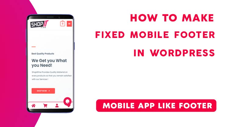
You can find a lot of plugins that will let you design and customize Footer for your WordPress manually & some will also let you design the mobile Footer separately. In this article, you will learn How to Get a Fixed footer for Mobile in WordPress, Just like an App.
Installing Required Plugin
To start designing the Footer we need to Install two necessary plugins,
Elementor:
Elementor is one of the simplest Page Builder as well as element builder, The free version of Elementor lets you create astonishing websites. We will be using Elementor to create the footer and later use another plugin to import the footer design in the live website.
There is a free version of Elementor that you can install and continue with your website. However, the Premium Elementor plugin lets you customize your pages as well as all the elements freely with a simple drag and drop page builder.
Footer and Header Builder for Elementor
This Plugin lets you use any Elementor design as a Footer or Header in WordPress.
Designing the Footer
Install and Active both Plugins one by one. Navigate to ‘Left Dashboard Panel > Appearance > Elementor Header and Footer Builder’ & then Click on it.
It will redirect you to a window from where you can create a custom Header as well as a footer for your website just by using Elementor Page builder. Not much heavy effort, anyone will be able to generate great output without even knowing simple Coding.
Adding Footer
Click on ‘Add New‘, then Name it ‘Footer‘, Choose the ‘Type of Template’ as Footer. Do not skip the step as it’s crucial to follow.
Then Click on “Edit with Elementor”, now it will open up the Elementor Page builder where you need to follow along with the video given below.
I’ve explained stepwise that How To Get A Fixed Footer For Mobile In WordPress, & how to make it responsive according to Multiple devices. The Footer made for a wide screen will only be visible for Desktop and Laptop Devices, though the Mobile Footer will be Hidden for Those.
Instead, the Mobile Footer will be shown for Devices like mobile, Tablets, etc. Wheres wide screen footer will be Hidden in this scenerio.
Related: How to add a Login / Signup Popup in WordPress
Adding CSS
After we have successfully created a Lookalike Footer For Mobile In WordPress with help of Elementor, It’s time to stick it to the bottom of the Mobile screen.
To Complete the action we will need a little help with the Cascading Style Sheet or CSS, which is used to design HTML elements.
Inserting ID Name:
You’ve to add an ID name to the Footer Element that you’ve created in Elementor so that you can trigger the element by adding the custom CSS Code. Manually add it or you can use the Plugin called “Master Addons for Elementor” which lets you completely add the custom CSS within the Elementor page Builder.
If you have Elementor Pro, you won’t be Needing the Plugin separately. If you do not wish to install either ‘Elementor Pro’ or ‘Master Addons’, Follow along.
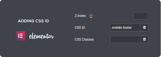
Click on ‘Edit the Section’, on the Editor window, open ‘Advanced’, Now look for CSS ID. In the Blank space fill an ID name.
Inserting CSS
When you’re done with Adding the CSS ID name to the Specific footer element used in the Elementor, You need to add the CSS respectively.
Here, in this case, I have used the ID name”selector”, Thus I’ve used the CSS selector as “selector”.
Simply copy the code below, and again navigate to the ‘left Dashboard menu > Appearance > Customize’, Once you’re in, Look for ‘Addition CSS’ at the bottom of all menus.
It’s the place where you can add Custom CSS to redesign any element used in the website. Paste the copied code & Boom!, You’re done with the setup. Footer is perfectly sticky.
The Concept of Adding CSS might sound confusing to a Beginner, though if it does, You can simply follow the video tutorial which will lead you to an easier way to executing the Process.
Conclusion
I Hope the Article about “How To Get A Fixed Footer For Mobile In WordPress” was helpful to you, Actually we uploaded the video on YouTube and started getting a huge response.
Thus we had to create an article explaining this video along with a simpler method of Adding CSS ID to HTML Element.
So, this was it in the ‘How To Get A Fixed Footer For Mobile In WordPress’ Article, hope you liked it. See you soon.
Get your Own WordPress Website
We are specialized in Website Development

Elementor footer is visible on desktop but not working on mobile devices. Any solution?
Go to advanced settings of Footer block, see in the ‘Responsive’ tab, if ‘Hide on Mobile’ is hidden or not.